|
Parts Button Properties dialog box
|
This property dialog box is used to set or change the pin connection information of buttons, which are one of the connection parts in the I/O Panel window.
Input to the simulator can be done from pin-connected buttons in the Simulation mode.
There are two types of button display styles, figure and bitmap. These styles can be changed on the [[Style] tab].
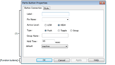
Figure A.61 | Parts Button Properties Dialog Box: [Button Connection] Tab |
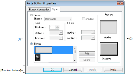
Figure A.62 | Parts Button Properties Dialog Box: [Style] Tab |
This section describes the following.
[How to open]
On the I/O Panel window, any one of the following:
- | Double-click a part object "Button". |
- | Select [Properties...] form the context menu on a part object "Button". |
- | Select a part object "Button", and then select [Properties...] form the [View] menu. |
[[Button Connection] tab]
(1) | Pin connection information setting area |
|
Label
|
This area is used to specify the part name. The part name input here is displayed on the button. Moreover, it is also displayed in the Parts List dialog box as the label.
|
|
Pin Name
|
This area is used to specify the pin name to be connected. The connection pins can be specified either via direct input or through selection from the drop-down list.
|
|
Active Level
|
The active state is selected with a option button, as follows:
|
|
LOW
|
Sets the active level to LOW.
|
|
HIGH
|
Sets the active level to HIGH (default).
|
|
Type
|
Button types are selected using option buttons, as follows:
|
|
Push
|
Makes the button a Push button (default).
The [Hold Time] item must be specified.
|
|
Toggle
|
Makes the button a Toggle button.
|
|
Group
|
Makes the button a Group button.
The [Group Name] item must be specified.
|
|
Group Name
|
This area is used to input the button's group name. Input to this area is possible only when [Group] has been selected in [Type].
|
|
Hold Time
|
Specify the time (hold time) for which the input value is to be held (default: 0.5msec). The settable range is from 0.001 to 999 (msec).
Input to this area is possible only when [Push] has been selected in [Type].
|
|
default
|
Specify the button status after CPU reset.
|
|
Not change at reset.
|
Maintains the button status after CPU reset.
|
|
inactive
|
Buttons are non-depressed after CPU reset (default).
|
|
active
|
Buttons are depressed after CPU reset.
|
Remark | For the pin names that can be specified, see the user's manual of the microcontroller that is used. |
[[Style] tab]
(1) | Style information setting area |
|
Figure
|
Select this option button to display the button with the following specified figure.
|
|
Shape
|
Select the figure shape. Two shapes can be selected: rectangle and ellipse.
|
|
shadow
|
Cannot be selected.
|
|
Line
|
Specify and change the figure line, as follows.
You can change the color of figure line by clicking the pull-down button.
|
|
Thickness
|
Specifies the line thickness.
Specification is made either using a spin button or through direct input.
A value from 1 to 100 can be specified.
|
|
Active
|
Specifies the color of the line during active display.
|
|
Inactive
|
Specifies the color of the line during inactive display.
|
|
Fill up
|
Specify and change the figure filling, as follows.
You can change the color of figure filling by clicking the pull-down button.
|
|
Active
|
Specifies the fill color during active display.
|
|
Inactive
|
Specifies the fill color during inactive display.
|
|
Bitmap
|
Select this option button to display the button with the following specified bitmap (default).
|
|
Selection list
|
Select a bitmap to be used from the selection list.
The selectable bitmaps appear in the selection list.
|
|
[Add] button
|
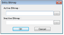
Opens the Entry Bitmap dialog box below to add a new bitmap to the selection list.
The bitmap file to be added can be specified either through file selection using the [...] button, or through direct input.
|
|
[Delete] button
|
Deletes the currently selected bitmap from the selection list.
Note that only the bitmap that have been added by user can be deleted.
|
This area displays the style of the button currently being specified.
[Function buttons]
|
|
|
|
OK
|
Validates the settings and closes this dialog box.
|
|
Cancel
|
Cancels the settings and closes this dialog box.
|
|
Apply
|
Cannot be selected.
|
|
Help
|
Displays the help for this dialog box.
|
[Operation]
In the Simulation mode, by clicking the displayed button, data can be input to the pin connected to the button.
The input format differs depending on the button type (push, toggle, group).
Figure A.63 | Connected Parts Display Example (Button) |
|
Push button
|
Clicking this button causes the active value to be loaded to the connected pin.
The active value is held during the hold time, after which it changes to the original value.
|
|
Toggle button
|
Clicking this button loads the active value to the connected pin.
The active value is held during the hold time, after which it changes to the original value.
|
|
Group button
|
Clicking this button loads the active value to the connected pin.
The value of the Group button having the same group name returns to the original value.
|


